
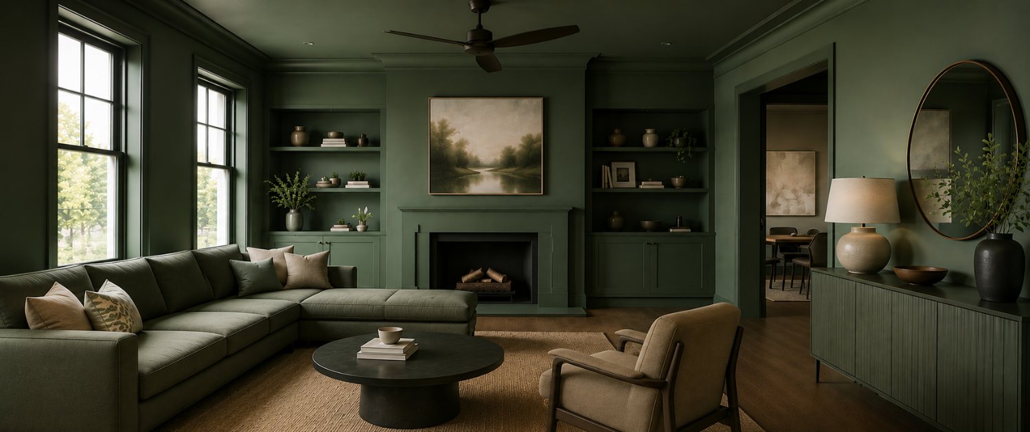
Walk into a room that feels finished the moment you step inside, and there is usually one decision quietly doing all the work. It is rarely the furniture. It is rarely the art on the walls. Most rooms that feel unresolved are missing something simpler: continuity. A wall painted one color, a ceiling left in flat white, trim in yet another shade entirely, each surface pulling attention in a different direction instead of working together.
Color drenching removes that competition outright. Rather than treating walls, ceiling, and trim as separate decisions made at different points in a project, the entire room is planned as one connected surface from the very beginning, and the difference shows immediately.
What Is Color Drenching?
Color drenching is a design decision where walls, ceilings, trim, and sometimes doors and built-ins are treated in the same color or tonal family, removing the visual breaks between surfaces so a room reads as one continuous, immersive space.
Rather than treating walls, ceiling, and trim as separate choices, the whole room is approached as a single composition. When a designer plans a space this way, everything else, furniture, textiles, lighting, is selected to sit inside that established mood rather than compete with a patchwork of surface colors.
Why the Approach Works
The traditional method, white ceiling, white trim, colored walls, creates visual stopping points throughout a room. The eye registers each transition as a break, which can make even a well-furnished room feel disjointed. Removing those breaks lets the architecture recede and the room read as atmosphere first, structure second.
Why This Is Shaping 2026 Interiors
Interior paint trends shift constantly, but this particular direction has staying power because it reflects a broader change in how homeowners want their rooms to feel. People are moving away from cool, fragmented palettes toward spaces that feel considered as a whole, and a single enveloping tone is one of the clearest ways a designer can deliver that.
From Cool Neutrals to Immersive Warmth
Homeowners are increasingly treating the ceiling, sometimes called the fifth wall, as part of the design rather than an afterthought left to the painter. This shift pairs naturally with the broader move toward warm minimalism, where restraint and material quality matter more than decorative variety. It is one reason color decisions work best when built into the earliest planning conversations rather than left until the end of a project.
How a Cohesive Palette Changes Small Rooms
One of the most practical benefits shows up in smaller spaces. A monochromatic room design removes the visual clutter created by multiple competing tones, which makes a compact room feel larger and calmer rather than busier. Because there is no transition breaking up the walls and ceiling, the eye reads the space as one uninterrupted volume instead of a boxed-in room with visible edges.
How a Designer Approaches This Decision
Choosing to treat a room this way is a planning decision, not just a paint selection. It affects how furniture, textiles, and lighting are chosen from the start, which is why it works best when it is part of the overall design conversation rather than a late addition.
A few principles guide the decision:
- The tone needs enough depth to hold interest across large surfaces without becoming flat
- Furniture and textiles are chosen deliberately to introduce contrast, since the walls no longer carry that job
- Lighting is planned alongside the color, since a single tone reads very differently under warm evening light than under daylight
- The existing architecture, molding, built-ins, window proportions, is factored in before the tone is finalized
Bedroom Applications
A bedroom benefits enormously from this approach because the goal of the room, calm and enclosure, aligns naturally with a single immersive tone. Warm clay, deep sage, or a muted terracotta wrapped across walls and ceiling creates a cocooning effect that flat white ceilings rarely achieve. FFF Interiors’ bedroom design services frequently build the full room plan, furniture, layering, lighting, around exactly this kind of color decision rather than treating paint as a separate step.
Living Room Applications
A living room takes more confidence to approach this way because the room is typically larger and more heavily used, but the payoff is proportionally bigger. A space wrapped in one warm, complex tone feels finished the moment the room comes together, particularly in rooms with strong architectural bones, crown molding, built-in shelving, where the color unifies rather than competes with existing detail. This is a recurring starting point in FFF Interiors’ living room design services, where the color plan is set before furniture selection begins.
Applying the Approach by Room Type
| Room Type | Design Direction | Effect Created |
| Bedroom | Warm clay, deep sage, or muted terracotta across walls and ceiling | Cocooning, restful atmosphere |
| Living room | Rich, complex neutral wrapped around existing architectural detail | Grounded, finished feel without added decor |
| Small bathroom | Deep, saturated tone across all surfaces including trim | Larger perceived volume, spa-like calm |
| Home office | Muted, focused tone with minimal contrast | Reduced visual distraction, improved focus |
How This Connects to Broader Design Direction
This approach connects naturally to several directions shaping 2026 interiors. Its emphasis on restraint and cohesion echoes the same thinking behind the Japandi living room guide, where every element earns its place and nothing competes for attention. It also supports a genuinely luxury feel in a way that has little to do with cost. A single, well-considered tone carried through a room reads as more intentional than a room filled with many separate finishes, regardless of the materials used.
For Lehigh Valley homeowners exploring how this fits into a broader design direction, working with a designer from the earliest planning stage means the color decision is made alongside furniture, lighting, and layout, not after them.
A Practical Way to Start
Homeowners hesitant to commit an entire room to one tone can test the approach in a lower-stakes space first, a small powder room, a reading nook, or an entryway. These smaller areas let the effect be evaluated at full scale without the cost or commitment of a primary living space. If the result feels right, the same thinking can extend into a bedroom or living room with far more confidence, ideally as part of a full design plan rather than a standalone color choice.
Conclusion
This approach succeeds because it removes decisions rather than adding them. Instead of choosing a wall color, a separate trim color, and a default white ceiling as three unrelated steps, the room is planned as one connected composition with a single clear direction. The effect is immediate: rooms feel more finished, more intentional, and considerably calmer, often before any furniture has been added back into the space.
The direction works in bedrooms seeking a cocooning, restful quality, in living rooms wanting to feel grounded without added decoration, and in small rooms that benefit from the illusion of continuous, uninterrupted space. What makes it worth building into a design plan in 2026 is not novelty. It is that this single, considered decision solves a problem nearly every home has: disconnected surfaces competing for attention, addressed at the planning stage rather than patched over afterward.